Friday, December 4, 2009

End of the Semester


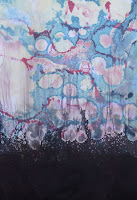
It's Friday morning, close to noon; probably will be noon by the time I post this. The printshop is empty this morning, no printing happening. Maybe there will be some activity later, maybe tomorrow, even Sunday. I hope so.

There are a few shots of the printshop in its current state. Of course it won't look like this on Wednesday morning. It'll be clean, inks and other materials will be returned to their assigned locations, tables, counter tops, the big island and the small island will be scrubbed clean. Brayers will be in their drawer with the roller-side up. Tools will be back in their drawer. The hot plate will look new. Glass inking slabs will be shiny and the duct tape trim around them will be cleaned of all the ink. The acid room sink will, again, look like a stainless steel sink. We'll say goodbye to any unclaimed pinwheels. The light table will be a clean expanse of light table. A chunk of final grades is based on "Printshop Rules and Maintenance", so beyond each of the assigned printshop duties each of you had for the semester, the general maintenance (including some of those duties) have been a bit lax. Make sure everyone pitches in between now and Wednesday to get the shop back to where it was on the first day of the semester, so everyone can reap the rewards.

Sunday, November 15, 2009

Exchange Portfolio: Reconciliation

Shawn McPheron's solar plate image was created with a photographic image manipulated in photoshop and then printed onto a transparency and exposed to the plate. He printed it with a modified graphite ink on tan BFK.


Rosi Benjamin's also created a solar plate print by drawing directly onto a transparency with India Ink and Sharpies and and then exposing it to the plate. Her printing involved a black intaglio with a transparent roll of a cool cyan and printed on a warm paper.


Kim Salaices' print is a linoleum cut printed over a digital image of pattern and chine colled onto a thin black paper, which she then sewed button eyes onto the rag doll and further stitched into the heart and body of the doll image.


Fran Detiel's print is a digital drawing printed onto a transparency and exposed to the plate, which she hand colored with transparent washes of acrylic, she burnt the edges of the print and also burnt the edges of the paper that the print was eventually mounted on.


Chris Little's print was an linoleum cut exploring cellular and tectonic issues, it was printed onto a map and then further mounted onto rag paper.


Almost all of the "artist's proofs" for the Reconciliation editions have been submitted. Actually they aren't Artist's Proofs since most of the editions haven't been printed yet, so each is actually referred to as a bon a tirer, which mean good to pull. Years ago print collectors use to consider an Artist's Proof as a prized acquisition because in the French tradition of printmaking an artist worked closely with a Master Printer. As the artist inspected the proofs that had been pulled by the Master Printer, the one the artist signed and labeled "B.A.T." (bon a tirer) was the one the artist wanted as a guide for the edition. This print took over as the coveted one for collectors because it was the first to meet the artist's standards and approval. However, because many artists now print their own editions and give equal attention to the first print as well as the last, the attention given to Artist's Proofs has become less important. Each print in the edition is of equal importance.

A colophon page is being prepared for the portfolio and it will have reproductions of every print created for the exchange since the portfolios will not contain all of the images. There will be 17 randomly collated portfolios of ten prints each, and one portfolio with all 17 prints as part of the printshop collection. Although I know that some of you are disappointed that the portfolios will not be complete, the budget would not allow for the editioning of 306 prints, that's a lot of ink and a lot of paper and lot of glassine and a lot of time. The had to be a reconciliation for everyone to get a good sampling of the entire group of prints, plus reproductions of the ones that are not included in an particular portfolio.

Examples of some of the prints are included with this post. They represent a diverse range of imagery and processing. They also represent a conceptual stretch of the theme that defines the portfolio.

Thursday, November 12, 2009

GYOTAKU

Rob's flounder


Brian's flounder


On November 10th, Mineo Yamamotto, a renowned fish printer from Japan, came to IUS to conduct a seminar and fish printing workshop. The event was hosted by the Department of Fine Arts and the School of Natural Sciences. We had twenty partcipants, twenty fresh flounder, and twenty experimental attitudes. The results were pretty remarkable, and I have posted two of the prints above. Mineo was very helpful and very engaging with his explanations and demonstration of the process. He also had several of his own works that were quite beautiful.

Wednesday, November 4, 2009

Relief Prints

Trista Escobedo


Shawn McPheron


Kimberly Fawbush


Khara Cornelius


Fran Dietl


Chris Little


Beth Dougherty


We viewed and discussed final relief prints today, with a selection of those prints reproduced above. Each will have an edition of at least 4, some may have more. Many of the prints explored multiple processes, and given the variety of approaches taken I think that a pretty broad range of educational and creative experiences were shared by many. Chris and Khara both were using maps as a printing base, with Chris printing on actual map sections and Khara on digital maps. Several explored chine colle, and Shawn, Beth, and Kimberly had some pretty successful results. Fran took advantage of translucent paper mounted over another and different color paper for her strong graphic image, while Trista printed her image over a dog foot print decorative paper that created an image of multiple complexities of meaning.

Relief prints, like all of the print processes prior to the digital, has a long history and tradition. However, during the last quarter of the 20th century printmaking went through a lot of changes, perhaps due to large contract print shops working with artists who didn't know how to create prints. Prints began to incorporate other media, they no longer were just flat images created with ink, paper, and pressure. They incorporated photographic processes, sculptural considerations, even elements of installation and video. The work created in those printshops was orchestrated by Master Printers, artists who knew how to create prints based on extensive experience and knowledge of the processes, and who worked with the artists who didn't know how to create a "print". Much of printmaking is about is about critical thinking, having an idea and exploring that idea through a process or processes, resolving creative problems, saying something new and visually engaging about the potentials of both the idea and the process. That takes skill, creativity, knowledge of what came before, and the ability to think critically.

After the relief prints are editioned, wonder what would happen if.......


Tuesday, October 20, 2009

Rob's Fuel Injectors


Rob's multi-media piece that's been installed in the downstairs hallway has provided some engaging and provocative discussions regarding content, form, and the conceptual associations of the viewer.  As one person commented, "It's a very smart piece." It's great having some smart art around. I'm not sure how much longer he intends to leave it in place, but if you haven't had the chance to look and think about it, please do so.  The concept of multiples is especially strong, and the combination of paint and silkscreened text add some pretty interesting layers of meaning.  

Wednesday, October 7, 2009

RELIEF PRINTING

The above relief print by Andy English is part of the portfolio, Walking on Water, that was organized by the print artist Debra Fisher. Although I am not sure if this is a linoleum or wood engraving, clearly the success of the image is the result of careful planning and superb drawing skills, and utilizing the graphic potential of black and white. 


Look back at Thursday, August 28, 2008 for a short video on relief printing. Linoleum and wood are the most common surfaces for relief printing, and for those of you who are considering wood, pine and poplar are perhaps the easiest to work with, although the grain of Pine if very hard to very soft and it's sometimes very easy to see cuts that have run away.  Be careful cutting into that surface. Poplar is more medium soft and the grain more even than Pine, and it'll hold detail better. Cherry and Pear are very hard and excellent for detail work with fine lines. One of the advantages of wood over linoleum is its ability to be embossed, such as placing a metal washer on the wood surface and tapping it into the wood to create circular shapes. Because of the flexibility of linoleum, such techniques are not as successful

If your idea for the Reconciliation Portfolio has a strong graphic quality, then a relief print may be your surface of choice. What do I mean by strong graphic quality? The ability to communicate your idea through Black and White and the range of optical grays that are the result of careful cutting.

Monday, October 5, 2009

Solar Plates

Rob did a thorough presentation of solar plate today, but with five missing in action, this is a recap (of sorts).

What is solar plate?: It's a light sensitized steel backed polymer material, that is exposed with U.V light such as the sun (solar, get it?) and developed with tap water.

How is it done?:  You can work directly on the plate with opaque materials in the form of non-water based pigments, or by exposing the plate through transparent film with artwork on it. The film may be created by drawing on acetate, photocopying or scanning and printing on film, or darkroom and/or photoshop techniques. A positive transparency is for printing an intaglio, a negative transparency is for printing a relief.

What etches the plate?: Water dissolves the unexposed portions of the plate.  Either in large bold areas or tonal ranges.

The artwork is prepared with a variety of materials, such as opaque liquids, drawing devices such as lithographic pencils and crayons, spray paint, etc.  It can be created by hand drawing, computer printout, of photographic methods.  Non-water based materials if working directly on the plate.  The images are created on transparent acetate or mylar. That transparency is used as a contact positive or negative.

The exposure has been set on the light table or exposure unit in the back of the studio for 20 seconds on the aquatint screen and 35 seconds on the transparency. Even though the plates can be exposed by sunlight, exposure units are preferred my most artists. The repeatable U.V. exposure offers consistency and reliability. The aquatint screen provides an continuous tone to the surface of the plate, while the transparency that contains the art work provides the image. The two together will create an image with full tonal or value range.  With solar plate you have to expose the aquatint screen not only for tonal range, but also for additional hardening in the open areas.

The creation of an image on translucent or semi transparent film are considered positive images. If, as Rob suggests, you use a digital positive instead of a hand drawn image, you can skip the screen, but you may end up with some "foul biting" unless you play with the positive some. If you use a digital positive, 'curve' the tones in photoshop so the darkest tone is no greater than 70% black and print it on your transparency  as a random dot bitmap.

Rob will print the plate on Wednesday and we'll recap further once someone is ready to expose!

Thursday, October 1, 2009

Plate's States and other areas.

The images below were selected for posting as they have utilized all of the processes we've explored to date. Intaglio is a tremendously versatile medium once the flexibility of its theories are explored and considered. Putting an acid resistant material on the surface of a metal plate and submerging it into acid can create all kinds of challenging effects. What are some acid resistant materials? We know asphaltum works, and soft ground, which is essentially a modified version of asphaltum that has a small dose of Vaseline. Other things that resist acid include crayons, sharpies, china markers, litho pencils, spray paint.... think about the fact that our acid solution is water-based, and then think about the things that don't mix with or dissolve in water.  Think of the possibilities.  


Shawn's proof has a lot of movement around the central face that explores line, value, and texture, and given the face has such importance in the image, some kind of drastic process might be worthy of consideration, such as sand blasting the plate to a mezzotint surface and pushing a tonal layer on top of the etched layers by careful scraping and burnishing.


Hayley's proof has a strong graphic quality that may do some interesting things when combined with chine colle. Sounds like a demo....


Chris's proof is developing some deep values and subtle imagery obfuscated by those deep values. Maybe some careful burnishing would help while maintaining the spontaneity of the image.


Beth's plate has lots of levels, values, and textures that may print beautifully as a color separation.  It may also be an interesting approach to actually cut into the plate edges to bring out some of the geometry.

 
Adrienne's proof  has some subtle soft ground passages and an effective progressive aquatint that she's now scraping and burnishing into, so that the value transitions are not so abrupt (a result of progressive aquatints). This image may also benefit from an application of Chine Colle.


We're moving further into the intaglio process and many of you have been able to get through our current state.  The Labor Day Holiday, the water main break a week ago, my absence on Monday have set us back a little, but I think the progress is pretty close to where we want to be.  Next week will be pretty full with Rob's Solar Plate demonstration, relief print demo, and some introductory color printing techniques.

Our intaglio plates have presented a wide variety of images, some suited to the process and some not so much so, but this first plate was to get experienced with many of the issues that present themselves in the course of etching and printing a metal plate.  Some of the many examples are presented above.  Each of these have gone through line etch, aquatint, and soft ground.  Beth also explored open bite to some extent, and many have utilized scraping and burnishing. A few of the plates have enough levels within the plate that they'll be good candidates for some color experimentations.  

Tuesday, September 15, 2009

INTAGLIO

We'll start working on metal tomorrow, creating images that print from below the surface, hence the word intaglio, Italian for engrave, carve, or cut. It covers a lot of different processes which we'll explore on 8" x 10" zinc plates.  Your image can be anything you want to explore except goofy cliche-type images.  Your image will be etched into metal, so make it matter. If you're desperate for something to explore through the processes, you can never go wrong with a self portrait.

I've put together a PowerPoint of some intaglio prints by a variety of artists who are recognized for their images and their techniques. Just click on INTAGLIO to see the variety of impressions.

See you in the morning.

Friday, September 11, 2009

September 11 Memorial Portfolio Exhibition

This was a 36 foot mural created by seven Fine Arts students on the front wall of the gallery.


Here some visitors viewing individual prints from the Memorial Portfolio.


Another point of view showing the rows of prints in the installation.


445 prints wrapping around the gallery have a quiet and emotional impact.


The exhibition opened Thursday evening with nearly 225 in attendance throughout the two hour reception.  Dr. Carol Pulin gave a very moving gallery talk reflecting on the impact of the events of 9/11/01 and the 445 artists who responded with an outpouring of expressive image. 

PrintSpin


The pinwheels have made it to the front yard of Knobview Hall.  The lack of rain and the thickness of some of the driftwood steaks required some drilling into the ground on Friday morning to planting.  Thurday's Basic Drawing class did an installation also using hammers and screw drivers to pierce the earth.  So we've had two different installations.  Above are some images from both days.

Thursday, September 10, 2009

PINWHEEL WORKSHOP

A monoprint created by Dr. Carol Pulin during the Pinwheel workshop she conducted in our printshop.


Susan Moffett brought her drawing class to the shop to participate.


Some of the colorful pinwheels await planting out on campus.


Trista Escobedo and Haley Bayley work on their prints that eventually were cut and folded and mounted on sticks.


Beth Dougherty moves leaves around on one of her prints that had been used as stencils.


Carol Pulin and Beth Dougherty inspect one of the offset prints in her pinwheel series.


Carol Pulin, Director of the American Print Alliance, was our guest in the printshop conducting a Pinwheel Workshop (see August 31 post).  It was an energetic, sometimes chaotic day of monoprinting and monotyping, starting at 9:00 a.m. and concluding around 4:30.  Many students come into the shop to participate and the result is a collection of Pinwheels that will be installed on campus to promote sustainable energy.  Enjoy, and hope to see everyone at the opening this evening of the September 11 Memorial Portfolio.  Carol will give a gallery talk beginning at 6:00.

Sunday, September 6, 2009

INTAGLIO

Hey, y'all.  Venture back to August 2008 to see a pretty sweet little 8 minute video about Intaglio, which we'll be starting a week from tomorrow. Go to BLOG ARCHIVE, click on the little arrow pointing to 2008,  then click on the little arrow pointing to August, then click on Intro to Intaglio, then click on the little arrow under the little screen and the video will start.

Friday, September 4, 2009

Monotypes: Round One

       Khara Cornelius


Christina Goins


Beth Dougherty


Amanda Straley


Rosi Benjamin


The first batch of three color separation monotypes are complete and the above are examples of images that pushed the process to a relatively wide range of color, values, textures, lines, and shapes. Some of the colors didn't translate well to this digital presentation and there may be some minor cropping to unskew the photographer's wobbly arm, but they're still readable. Each was based on the idea of Insanity introduced during class discussion and elaborated on the 8/24 and 8/28 posts.  It'll be interesting to see how the initial experience with this processes expands in subsequent efforts. Refer to your monotype handout and your notes for mixing inks.

See you on Wednesday for the Pinwheel workshop with Carol Pulin.

Monday, August 31, 2009

PINWHEELS/PINSTALLATION

Dr. Carol Pulin will be conducting a pinwheel workshop with us on Wednesday, September 9, during print class and perhaps for a good part of the day.  You can see some examples and read some about it by clicking HERE. Make sure you read the article that is in a pdf by clicking on that when you get to the bottom of the page. You can also re-read the quote by Carol in our class syllabus to refresh on the background and motivation for the workshop. The important thing is to come prepared, so create some drawings between now and then that deal with the idea of sustainable power, wind-power, landscape and all of it parts, text/poetry about our planet and helping it heal, green......

Read the article, and then respond with any questions you might have and we'll get the discussion going in preparation. 

Sunday, August 30, 2009

MONOTYPATHON

I spent a good chunk of the weekend in my studio trying some insane printing, thinking about what would be a "wild and crazy" way to make monotypes using the three color process. I started with Kroger bags filled with air, then I decided to go to the store and pick up some balloons. Found those kind you tie into little animals. Then decided to try round balloons. I'll bring in what happened tomorrow morning.

Friday, August 28, 2009

INSANITY II: Form and Content

It's Friday and the shop is empty....hmmmm.  It's a beautiful day for printing.  We will be spending some time looking at our prints at the beginning of class on Monday, seeing where we are with the form and getting a sense of whatever content is there.  Most of the current impressions are yellow, a bright yellow.  I don't know if that content expresses insanity as much as it expresses yellow.  Don't be afraid to make marks, create textures, roll some ink on your mylar, put on an old pair of pants, and sit in the ink.  Is that insane?

Form is the physical manifestation of a work of art that includes the media, such as yellow ink on white paper, the manipulation and arrangement of the visual components, such as yellow shapes creating white shapes on white paper, and the subject matter as it is treated as components, such as yellow and white shapes on white paper.  It is what the work looks like. So I guess we can discuss yellow and white shapes. THAT'S INSANE!  There are a few that have gone beyond that, only a few.

Content is the message the you intend to communicate = INSANITY.  It could be found in the subject matter, Shawn mentioned Munch's, The Scream, a kind of narrative that tells a story.  It may be emotional or intellectual and could include the way the media is manipulated if that manipulation is driven by an idea, like Chris' juxtaposed symbols of the pyramid and the other thing, whatever that thing is, or even Rob's current investigations of surface and materials. Jackson Pollock, you know him, you know his work, made paintings with a particular idea about painting in mind. Not about an image but about a process. The way your work is created will become an important part of the content and should be clearly seen in the finished piece, or maybe not so clear. INSANITY, as mentioned before in some obtuse way, could very much tap into the OCD part of us.  Imagine a color filed of yellow filled with dots, over printed with a color field of Cyan filled with dots, over printed with a color field of magenta filled with dots....that's INSANE!

Almost every monotype on the drying rack, even at this early stage, has both form and content. Even when they're finished they'll have both, but surely and not likely in equal amounts. How would we even measure that? That would be an insane exercise. It's actually a continuum where each monotype, or each piece you create, falls on a line that runs the gamut between being purely formal, think of those Josef Albers' yellow squares, to purely content, such as Basquiat, although both of these artists still have varying degrees of form and content.  Or better yet, the work by conceptual artists, their artwork was/is about ideas, maybe a better analogy referencing purely content. Conceptual art had/has very little physicality and thus nearly no form. Push your form/content into an insane place, and....

Happy printing.

Monday, August 24, 2009

INSANITY

Van Gogh cut off his ear, not a strong indication of sanity. Michael Jackson, hmmmmm? What about some of the surrealists, such as Salvador Dali, Paul Klee, Max Ernst, Jean Dubuffet, maybe even George Baslitz.  They attempted to, in a sense, create a kind of "insane" art by using their dreams as blueprints for their pieces.  While not overly abstract and usually chocked full of symbols in order to lose all obvious coherence (and thus the comprehension of the audience); the surrealists created what was bizarre and strange. Where those mentioned above, insane? There have been countless studies connecting insanity and creativity.  Some of those studies are both compelling and convincing.  Maybe, because we are all creatives, with a capitol "C", and we spend more time on one side of our brain than the other, we are a little insane.  I've had those days. Of course that calls into question, is it the art that brings on our 'insanity' or are we drawn to art because we're insane? Italian psychiatrist, Cesare Lombroso, noted that all the artwork created by "lunatics" exhibited the same basic characteristics: distortion, repetition, minute detail, arabesques, obscenity, and rampant symbolism. However, the most important characteristic of insane art is its creativity. We're going to tap into that part of ourselves for our first project of the semester, a three-color separation monotype based of the theme INSANITY.

Saturday, August 22, 2009

FALL SEMESTER 2009

Welcome to a semester of printmaking.  A syllabus for the course has been posted on our ONCOURSE site, and I will have hard copies available for you on Monday morning.  This blog was created last year for my fall 08 class.  There are many postings of interest to printmakers, especially those who are about to get their feet wet for the first time.  Please spend some time looking at some of the work, videos, and discussions.  This blog will be updated regularly with information particular to our creative investigations this semester, so stop back often.

Monday, March 2, 2009

Green Door's International Print Exchange

The Green Door, a small open access printmaking studio in the UK is seeking an indication of interest in an international print exchange.  A small edition of maybe 10 prints, restricted to "hand-made prints using any technique you wish."  Anna Johnson would like to hear from those who would like to participate.  If you'd be interested in participating, please respond to Anna at:

ipe@greendoor-printmaking.co.uk