Wednesday, February 2, 2011

Monotypes - the next batch

The rest of the monotypes came in yesterday, after that 'final' layer of color was printed. There are some that could use, yet, another layer of color or black. This approach to monotype printing, layering process colors reductively one on top of the other, can be laborious depending on the image one is trying to achieve, or on the image one thinks they are trying to achieve. Sometimes the process and the image take an entirely different direction depending on the aesthetic position one prints themselves into. However, there are many interesting things that happen when wet inks get pushed and pulled into shapes, textures, and value transitions.


Wende was inspired by air pockets trapped under ice. Her direction created a strong image of organic symmetry that almost takes on a Judy Chicago sensibility.


Sam's exploration is rooted in nature, and in this print he explored a road winding through a landscape that takes on a theatrical set feel. It's dark and dense, but then there is a glimmer of hope over the horizon. It may be good to back out of the landscape some and enjoy the light.


Robin is exploring text and image, challenging us to understand the content and function of those combined visual elements. Expanding the inspiration by researching those artists who combine words into their images might be a worth while goal. It makes me wonder about the potentials of creating an image out of just text.


Nick is exploring the things in his life that he enjoys, and guess what one of those enjoyable things is? Some very subtle line work around the basketball started to suggest a sense of movement, maybe even animation. It would be equally enjoyable to push that quality more.


Lori is continuing the nature theme that she began exploring during the summer. Like Robin, she also combined image and text in this print. Again, researching artists who approach their imagery with that combination would be a way to strengthen that concept. Does readability matter? When and in what context?


One of the Daniels in the group, who I will from now on refer to as Frank, is interested in movement and sound, and in this print he explores the little thingys or buttons on a sound equalizer. Playing off their positions with light and color. Frank responds to the "beauty of movement."


One of the Davids is interested in robotics, technology, and machinery incorporated into living forms. His cyborg hand has potential that just needs a bit more technology.


The other David, like Nick, also shares a passion for basketball. He explored the game through a series of drawings last summer and is continuing that this semester. He may be pushing it into overtime, but this is a fresher point of view that may be the result of where he's positioned with the process.


The other Daniel, who, like Frank, is very interested in sound, particualry music, and has explored that passion in some of his work, also has a passion for cars and all the parts that coalesce into cars. He intends a lot more layering with his caddy.

Monday, January 31, 2011

New Monotypes

Below are some of the finished (maybe) examples of three color separation monotypes from my printmaking class. There are many strong impressions, but I selected these as examples of the process being pushed, experimented with, a good grasp of the color theory involved and the interaction of the colors. I also think that the ideas work well with the process, strengthening the content of the final image. Click on any of the images for a closer look at detail.


Pako utilized patterning from his Mexican culture and his aesthetic as a graphic designer to create this whimsical and optical exploration of color, design, and craftsmanship. Each layer was meticulously reduced with such attention to detail that there are no areas where the ink piled up against the contours. It's very clean and precise.


Miranda created this impression based of kitschy animal figurines that results in an almost Disneyesque gathering of characters. She pushed the process well beyond the expectations and pulled the image through the press maybe ten times, layering more colors and values that is the usual or expected. She also carefully crafted and rendered each form.


Louise returned to a previous image that she was not as pleased with, and the second go-around resulted in an image rich with color and form. She was able to reduce the colors to a more muted palette, although there is still some intensity to her colors. Nevertheless, she took advantage of the range of color intensities and values.


Dani is exploring self-portraiture with her print work this semester and pushed this version through the press five times, I think, to create an aggressive yet contemplative expression. Each color was carefully reduced and rendered.


Beth also revisited an idea she explored previously in painting, but with the layered approach, she created a new version of her 'tree' that is full of textures, intense colors, and abstract shapes.


Anna is exploring the concept of 'home' with her work this semester, and her first interpretation was this very textural nest with egg-like shapes centrally located within the layers of color and texture. This is one of those prints that took advantage of an undefined edge to the image, thus creating a softer termination to the traditional rectangle.

Tuesday, January 11, 2011

Spring 2011 Printmaking

Today was supposed to be when we met for our first class of the spring semester. Instead, I'm sitting in my office in a building that emptied at noon because of the accumulating snowfall. I recall this same thing happening last year, also on the first day of class. What's that about?

This class cancellation will cause some minor changes in the schedule and we'll have to double up on some things when we meet on Thursday to stay on track. There will be lots to look at, talk about, and act on; it'll be fun. I think a collaborative monotype will be on the agenda.

So, that being said, there's not much else to report for now, especially since no one is reading this yet. See you on Thursday.

Friday, May 7, 2010

Off To Wonderland

Another semester is over, portfolios are scattered around the studio, Wonderland exchange portfolios have been distributed, and the shop is clean and ready for a new crew. The above image is the colophon page for the exchange portfolio. Since the portfolios do no not contain every print by every one involved, but rather ten random prints, all of the impressions are reproduced on the colophon so that everyone at least has a 'history' of the images created. Based on past exchanges, I didn't think the Wonderland theme was our strongest.

The discussion of the portfolio started by generating ideas within the entire group. In the course of throwing out possible themes, someone suggested "Alice in Wonderland." During the brainstorming session that was distilled down to just Wonderland, which has all kinds of potential. But there were some who embraced Alice's journey nevertheless, so there are a number of prints in that land and some that ventured into new territory.

Each participant printed an edition of eleven, and many of those editions were very well printed, with only slight variations. A few were questionable and could have used a few more impressions from which to cull a solid edition of eleven, but all in all, it was a good project and a rewarding portfolio. I hope all who participanted are happy with the collection of prints they received.

Enjoy the spring and summer wonderland.


Tuesday, April 20, 2010

Fine Arts Open House


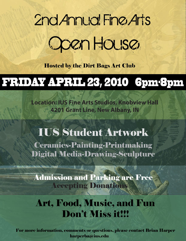
The Dirt Bags Art Club is hosting the 2nd annual IUS Fine Arts Department open house on Friday evening from 6:00-8:00. Please bring in some of your prints if they're not already in the shop so we can put some out in the hallway and in the pritnshop. Bring your friends and family. It was a blast last year going from studio to studio seeing what everyone was creating. Good music and food, and creative fellowship. Hope you can make it. Click on the image above to see the particulars of the event.

Monday, April 19, 2010

Post-Morrison

It's a new week in the printshop, the last push toward the end of a busy semester. David packed up on Saturday and headed back north to Indy/Herron. The printshop feels a little different this morning, although there are remnants of the energy from last week. After the last color was printed on Friday afternoon, we gave a big push to get things cleaned and packed so David could get an early start.

The prints were collected off the tables and loaded onto the drawing rack.

Even managed to catch Donna off guard for one the rare photos of her, couldn't pass up sharing it with you.

Rob was very focused on getting the ink slab cleaned and the roller. He was especially helpful during the week and soon after he and David started printing earlier in the week, they had developed a very efficient process. I figure the press saw around 800 runs, from stretching paper to the final color.

This is the final run next to the final print.

Another of Donna loading prints onto the drying rack.

This is the group of drawings on frosted Mylar that David executed during the week and that were exposed to the photo positive plates to develop the image. They are sitting on a light table.

It was a very rewarding experience for all of the printmaking students to see David working and fully explaining what he was doing and why he was doing it. I think the experience will inspire more lithography in the coming semesters. The drawing students, from beginning to advanced, also benefitted from the numerous presentations by David, showing his work from his undergraduate days and how his process and content grew over the years to his present concerns.

Thank you, David, for everything!

Friday, April 16, 2010

David Morrison's visit/day 5

This has been a super week in the printshop with David working on the print below. The final color (maybe) is being printed today, a deep charcoal grey. It makes the image come to life with light and movement.

David also added more transitional passages of value to the final color that makes the space both more real and more surreal.

David studying the final proof before printing the last run of color. Of the two versions here, the left is the one he's going after. It was not as heavy since he changed the exposure of the plate and pulled back away from the darker color. It's a beautiful print.