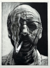
David is currently Professor of Art at the Herron School of Art, Indiana University/Purdue University at Indianapolis. His work has shown in numerous international, national, and solo exhibitions in which he has received over seventy awards. His work is included in numerous public and private collections and he has been a visiting lecturer and guest artist at a number of universities. David graduated from the University of Wisconsin-Madison in 1985 with Master of Fine Arts and from the University of South Dakota with a Bachelor of Fine Arts in 1981.
Thursday, March 18, 2010
DAVID MORRISON VISITING ARTIST
Thursday, March 4, 2010
GROUP PORTFOLIO PROJECT
Reworked Intaglio
This is Troy's reworked intaglio plate, with the original impression on the right and the new version on the left. He did a lot of scraping, sugar lift, aquatint, and line etch, transforming the image from the crouched figure to an "A-Bomb." If you look closely at the background, you'll see the mountain range he included in his image.
Tatum pulled some existing shapes out of the heavily etched plate, the original impression is on the bottom, she did some scraping and burnishing and then some open-bite to create an abstract pattern of positives and negatives.
Pako found in his original impression, the bottom image, a car buried in lots of dark texture. He pulled that out with scraping, burnishing, and sanding, and then added some text and additional imagery.
Daphne selected a deeply etched plate of shapes suggesting fingers, the bottom impression. There was a lot of open-bite, so she continued with that approach by adding imagery of a "polaroid" shape and some vine, and added a subtle aquatint into the image area of the polaroid.
Danny found a skull buried in this deeply etched plate, bottom impression, and used his scraper and burnisher to bring out that feature. Then he got rid of all the other information by scraping, burnishing, and sanding. After getting the plate back to a nearly clean surface, he added another scull and other shapes set off by a lightly etched aquatint.Friday, February 26, 2010
ROB IN THE SPACELAB
Rob standing in the Spacelab after his opening. The beard and the wall compliment each other.
The Fuel Injectors from a previous installation Rob had in the hallway have now incorparated the space into the work.Rob opened in the Spacelab yesterday with a group of works that transformed the 'lab' into a gallery. He did everything (sans cookies) from creating a lighting system to heating the space (a welcomed comfort). It's an interesting group of works that he's testing in preparation for his thesis exhibition that will be opening in the Barr gallery on Thursday, April 8. Well done, Rob.
Monday, February 22, 2010
Exchange Portfolio: Reconciliation

As in almost every previous semester, we will be undertaking a group portfolio exchange project this semester. Discussion of the project will be March 1 to decide on the theme, media, paper and image size, and edition number. Last semester there were 17 participants, each creating an edition of 11 impressions based on the theme “Reconciliation”, each print was on 9” x 12” paper with an image size of 5” x 7”. At the end of the semester, each participant received a portfolio of 10 randomly selected prints, while the shop received one complete portfolio of 17 impressions. The decision to not create editions of 18 was primarily cost related. 17 people printing editions of 18 impressions would require a lot of paper and a lot of ink.
The theme for the project is very open, but unlike the current 200 level intaglio project, this portfolio theme will be pursued by everyone rather than having several themes going at once. This allows for a collaborative strengthening of ideational fluency, taking an idea and interpreting it through each of the 17 unique sets of experiences, perceptions, and mediums. The media is also open and will ultimately be decided by each participant. At the moment, we have a few working in lithography, a few in silk screen, a lot of intaglio, and soon many more in relief. An exchange portfolio that explores all of these processes creates a more intriguing collection of prints than a portfolio that explores only one process.
Wednesday, February 10, 2010
Exhibit Opportunity
Tuesday, February 2, 2010
Monotypes, Phase I
Shawn created this image that is not particularly characteristic of the usual resulting palette of bold intense colors. I think he's still going to run another layer or two over this to push the atmospheric perspective even more.
Pako's confident drawing style that embraces illustrative rendering blended well with the separation process that resulted in a wide range of colors and values and a sense of animation.
Miranda explored an idea of image stereotypes that pushed the palette into interesting and expressive directions with bold colors and composition.
Mel looked at the abstraction of text, shape, and color to create the complexity of camouflaging pattern .
Greg looked at various travel images for inspiration and created this brightly colored sea/land scape.
Danny shows one of his influences in this pseudo-diabolical portrait that has an interesting contrast of colors carrying the content to other unexpected places.
Aberlyn's self-portrait has a strong sense of the dramatic created through her drawing/design skills and the resulting palette, belying the contemplative expression on the face.These and many more prints represent a big batch of monotypes in my office that are fresh off the press. So fresh, in fact, the fragrance is filling the room with the sweet aroma of the printshop. Several of you have been down this path before, but there are about twelve who explored this method for the first time. I think the veterans showed obvious signs of growth from their last efforts with the three color separation process, and those exploring for the first time did some pretty competent things as well.