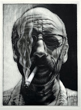
Below are some of the finished (maybe) examples of three color separation monotypes from my printmaking class. There are many strong impressions, but I selected these as examples of the process being pushed, experimented with, a good grasp of the color theory involved and the interaction of the colors. I also think that the ideas work well with the process, strengthening the content of the final image. Click on any of the images for a closer look at detail.

Pako utilized patterning from his Mexican culture and his aesthetic as a graphic designer to create this whimsical and optical exploration of color, design, and craftsmanship. Each layer was meticulously reduced with such attention to detail that there are no areas where the ink piled up against the contours. It's very clean and precise.
Miranda created this impression based of kitschy animal figurines that results in an almost Disneyesque gathering of characters. She pushed the process well beyond the expectations and pulled the image through the press maybe ten times, layering more colors and values that is the usual or expected. She also carefully crafted and rendered each form.
Louise returned to a previous image that she was not as pleased with, and the second go-around resulted in an image rich with color and form. She was able to reduce the colors to a more muted palette, although there is still some intensity to her colors. Nevertheless, she took advantage of the range of color intensities and values.
 Dani is exploring self-portraiture with her print work this semester and pushed this version through the press five times, I think, to create an aggressive yet contemplative expression. Each color was carefully reduced and rendered.
Beth also revisited an idea she explored previously in painting, but with the layered approach, she created a new version of her 'tree' that is full of textures, intense colors, and abstract shapes.
Anna is exploring the concept of 'home' with her work this semester, and her first interpretation was this very textural nest with egg-like shapes centrally located within the layers of color and texture. This is one of those prints that took advantage of an undefined edge to the image, thus creating a softer termination to the traditional rectangle.


