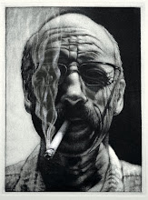
I'll have some highlight images to post after reviewing the final portfolios of prints, but I wanted to jump in with thoughts and impressions before they faded into the fog of grading.
Our meeting time is from 1:15 - 4:15, but in spite of having an extra week after the last class meeting, there was still a flurry of printing activity in the shop, and yet our discussion faded around 3:00. It would have been great if that flurry had been a constant throughout the semester, but as one student said, "I work better under pressure," so most of the work was done within the past few days.
The discussion started with a recap of printmaking impressions, the "love/hate" relationship was touched on, but that discussion pretty much existed between me and Allison, and we returned to that topic a number of times to open up other possibilities, other perspectives, other takes on love/hate. Few were offered. We passed around intaglio prints, exchange portfolio prints, relief prints, but there was very little discussion in the course of those sharing moments. I used to kick myself in the butt for not offering my thoughts and impressions when I was a student. Now I can yak it up, but only for so long as I keep digging for interaction, eventually someone else needs to make an offering. Once we got to the advanced folks the discussion became a little more interactive. Rob discussed his approach to creating imagery, particularly through the print processes. He really has the mindset of a printmaker, engaged with the variety of approaches to creating imagery and following with detailed explanations of how he created those images, and he clearly recognizes the perk of "multiples": process over image. Brent has a very different approach. He has a "reductive" mindset, or at least for this semester, and had a number of woodcuts, wood-engravings, and a silkscreen/relief combination. His approach is very much from an illustrative perspective: image over process. Julie has been working on a 'quilt' of small relief prints, mostly wood cuts, that she's sewn together by hand. It's an engaging piece, but would be much more so with a companion piece, which she may may be able to accomplish by the time her senior exhibition opens in February.
There was discussion about the trials and tribulations of creating prints, the unpredictability of acid's reaction to metal, such as demonstrated in Krystal's intaglio. There were also other interesting resolutions in the mix. Alex did some unique explorations with his intaglio plate; Allison did equally engaging work with her solar plates; Kristie created an image for the "tension" portfolio that she's now hand coloring for the final edition which heightens the tension of the image; Anthony's relief is not only tense in concept, but in execution with all of those tiny diagonal lines defining the image; Jay's "Bloons" was an interesting take on Tension and that's one that I have to think through a little more....a clown hanging from floating balloons...hmmmm; Michelle's was also interesting in concept with a view of an 8-ball - - perhaps calling that last pocket, that always makes me a little tense.
Check back in a few days for final images of the semester.
 This is a linoleum cut that Kristie planned and worked on for several weeks. A very carefully planned relief print that required considerable focus on positive and negative relationships.
 This is a detail of a quilt that Julie created from the small relief prints she created from linoleum and woodcuts, using found natural objects from her environment as subjects. All hand stitched.
 This is a detail of a reduction woodcut that Brent created trying to tap into our fears. Actually, it is kind of scary.
 This is a black and white monotype that Alex created which shows his deft facility for illustrative rendering.
 Anthony created this black and white monotype, a self portrait that I said looked like Kevin Spacey....he titled it Kevin.


