 Shawn created this image that is not particularly characteristic of the usual resulting palette of bold intense colors. I think he's still going to run another layer or two over this to push the atmospheric perspective even more.
 Pako's confident drawing style that embraces illustrative rendering blended well with the separation process that resulted in a wide range of colors and values and a sense of animation.
 Miranda explored an idea of image stereotypes that pushed the palette into interesting and expressive directions with bold colors and composition.
 Mel looked at the abstraction of text, shape, and color to create the complexity of camouflaging pattern .
 Greg looked at various travel images for inspiration and created this brightly colored sea/land scape.
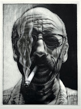
 Danny shows one of his influences in this pseudo-diabolical portrait that has an interesting contrast of colors carrying the content to other unexpected places.
 Aberlyn's self-portrait has a strong sense of the dramatic created through her drawing/design skills and the resulting palette, belying the contemplative expression on the face.
These and many more prints represent a big batch of monotypes in my office that are fresh off the press. So fresh, in fact, the fragrance is filling the room with the sweet aroma of the printshop. Several of you have been down this path before, but there are about twelve who explored this method for the first time. I think the veterans showed obvious signs of growth from their last efforts with the three color separation process, and those exploring for the first time did some pretty competent things as well.
Learning a new process, or expanding on a process that clearly still possesses an element of surprise is always fun and challenging. Sometimes, though, the challenges can present themselves as barriers depending on how much or how little we tap into that side that is the creative part of who we are. Try not to let the those challenges of process become a barrier to your creative development, rather, embrace the challenge so you can express your visions, and be open to allowing the vision to take a different direction depending on the challenge. Printmaking, as you all know, and as we've discussed, is about deferred gratification. The thought process can be very convoluted at times, but the discoveries can be vastly rewarding.
I posted the images above because of their finished, resolved quality, and how they utilized the color separation process. Also how they resolved visual issues through that process without resorting to solutions outside of the process. Many of the pieces can be resolved by becoming mixed media, maybe even becoming stronger as such, but confronting creative problems that still have the potential for strong resolutions can be very satisfying, and edifying.

3 comments:
I'm not sure animation is the right descriptive for Paco's print. Maybe whimsical...? Paco always has fun in the studio, singing and dancing, and I think that shows. He has some strong drawing skills to pull it off as well. It reminds me of children's book illustration.
So I guess it's just me and you, Shawn. I agree that Pako's print (he has corrected me on the spelling 0f his name) does have a whimsical feel about it. My comment about animation has to do with the subject and the range of color, it's like a still from a Disney animation from the 60's/70's. I think he handles it really well.
I'm still here Brian. One of the bog prints you put on facebook reminds me a bit of Shawn's print. It has that misty feel to it in the background. Have you seen those Shawn?
I really liked Pako's print. It made me feel like a little kid. Who did the one of the sea scene again? That one was awesome!
With mine I had thought of adding a couple more runs to it as you suggested in your comments when you gave my grade, but, I hadn't thought of adding more black. Thanks for that Brian!
Post a Comment