Brian Harper has posted a video of Rob's visit on his blog and shared it with me to post here. Enjoy.
Wednesday, February 16, 2011

Rob Wooley Day in the Printshop

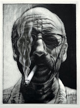
Rob Wooley was our visiting artist in the print shop yesterday and he stayed busy from early morning until late in the evening. He discussed the directions of his recent work, and the explorations with a variety of materials, including exotic papers that he chine colles onto one-of-a-kind prints. His two demonstrations were very informative. It was great having him back in the shop.

We all gathered around to look at the portfolio of prints that Rob brought with him. The layering of paper that he's utilizing with his work creates some really beautiful images, subtle veils of color and texture like the print at the top adds an almost spiritualness to the images. There are no longer hands or figures or portraits in his images, or at least not that are immediately readable. But instead dense textures, passages of light, and movement of amorphic shapes. Pretty amazing things happening in his work in what seems like a relatively short time.

Here Rob demonstrates the application of a tusche wash on a zinc plate, pushing it around while it's fluidity allows. After it dried, he etched it in nitric acid. The particles of the tusche produced a rich and velvety aquatint.

We had some refreshments before Rob began his presentations. Miranda was all about it!
Thursday, February 10, 2011
Visiting Artist Rob Wooley
Rob Wooley, BFA alumnus 2010, will return for a day of printshop demonstrations on Tuesday, February 15. Rob is currently pursuing his MFA in printmaking from the Herron School of Art. Rob will be demonstrating a process that replicates tusche washes on etching plates and possibly another that involves waxing prints. It'll be a print party so bring some goodies so we can keep him fed.

Last year's Rolling Knob Press artist, David Morrison, created a multi-colored, multi-plate lithograph. Rob served as the chief assistant in the printing of that edition.

The installation of Rob's thesis exhibition in the Barr Gallery that included lithographs, silk screen prints, digital prints, offset prints, and a variety of mixed media.
It'll be good to have Rob back in 'his' printshop.
Tuesday, February 8, 2011
More Solar Collaboration

The lamp went out on the exposure unit today in mid-exposure. Beth had already expose the aquatint screen and was in the continued process with her positive, but there was no light to reflect. So we took advantage of the sunny but cold day and did the second exposure in the sun. Given that it's winter in the midwest, we tried a four minute exposure that seemed to be just the right amount of time. Beth's puppies as an intaglio proof is the result. The plate, positive, glass and blotter were clamped to a board for the makeshift exposure unit.
We tried a second time later in the afternoon with one of Wend's pressed plants, but we forgot to use the aquatint screen in the middle of the exposure, so we ran back into the studio after about two minutes and exchanged the plant for the screen, ran back out into the sun for three minutes, ran back into the studio and switched the screen for the plant, and then back out into the sun for three more minutes. The resulting image is like an early Motherwell painting, black organic shapes against a white field. Wende is going to experiment with some off-set, overlapping color impressions of the plate to see what the potentials might be.
Friday, February 4, 2011
Collaboration

Wende and I worked in the shop today experimenting with the printing of a solar plate that she created by using dried and pressed seaweed as her positive for exposure. After a few tries with various ink viscosities, an impression was finally pulled that seems to take advantage of the image and the printing process. An intaglio color was applied as a blend and wiped tightly with tarlatan and phonebook paper, and then a surface roll blending from a transparent blue up to a pale yellow was applied. It seemed to do the trick. We had printed a few previous, but problems with the blemished roller, color intensity, and the lack of compatibility of the surface blend colors presented some problems that eventually were resolved. It became very clear, however, that the shop needs new rollers. In spite of that issue, I think Wende has a strong direction that should be lots of fun expanding and exploring.
Wednesday, February 2, 2011
Monotypes - the next batch
The rest of the monotypes came in yesterday, after that 'final' layer of color was printed. There are some that could use, yet, another layer of color or black. This approach to monotype printing, layering process colors reductively one on top of the other, can be laborious depending on the image one is trying to achieve, or on the image one thinks they are trying to achieve. Sometimes the process and the image take an entirely different direction depending on the aesthetic position one prints themselves into. However, there are many interesting things that happen when wet inks get pushed and pulled into shapes, textures, and value transitions.

Wende was inspired by air pockets trapped under ice. Her direction created a strong image of organic symmetry that almost takes on a Judy Chicago sensibility.

Sam's exploration is rooted in nature, and in this print he explored a road winding through a landscape that takes on a theatrical set feel. It's dark and dense, but then there is a glimmer of hope over the horizon. It may be good to back out of the landscape some and enjoy the light.

Robin is exploring text and image, challenging us to understand the content and function of those combined visual elements. Expanding the inspiration by researching those artists who combine words into their images might be a worth while goal. It makes me wonder about the potentials of creating an image out of just text.

Nick is exploring the things in his life that he enjoys, and guess what one of those enjoyable things is? Some very subtle line work around the basketball started to suggest a sense of movement, maybe even animation. It would be equally enjoyable to push that quality more.

Lori is continuing the nature theme that she began exploring during the summer. Like Robin, she also combined image and text in this print. Again, researching artists who approach their imagery with that combination would be a way to strengthen that concept. Does readability matter? When and in what context?

One of the Daniels in the group, who I will from now on refer to as Frank, is interested in movement and sound, and in this print he explores the little thingys or buttons on a sound equalizer. Playing off their positions with light and color. Frank responds to the "beauty of movement."

One of the Davids is interested in robotics, technology, and machinery incorporated into living forms. His cyborg hand has potential that just needs a bit more technology.

The other David, like Nick, also shares a passion for basketball. He explored the game through a series of drawings last summer and is continuing that this semester. He may be pushing it into overtime, but this is a fresher point of view that may be the result of where he's positioned with the process.

The other Daniel, who, like Frank, is very interested in sound, particualry music, and has explored that passion in some of his work, also has a passion for cars and all the parts that coalesce into cars. He intends a lot more layering with his caddy.
Monday, January 31, 2011
New Monotypes
Below are some of the finished (maybe) examples of three color separation monotypes from my printmaking class. There are many strong impressions, but I selected these as examples of the process being pushed, experimented with, a good grasp of the color theory involved and the interaction of the colors. I also think that the ideas work well with the process, strengthening the content of the final image. Click on any of the images for a closer look at detail.

Pako utilized patterning from his Mexican culture and his aesthetic as a graphic designer to create this whimsical and optical exploration of color, design, and craftsmanship. Each layer was meticulously reduced with such attention to detail that there are no areas where the ink piled up against the contours. It's very clean and precise.

Miranda created this impression based of kitschy animal figurines that results in an almost Disneyesque gathering of characters. She pushed the process well beyond the expectations and pulled the image through the press maybe ten times, layering more colors and values that is the usual or expected. She also carefully crafted and rendered each form.

Louise returned to a previous image that she was not as pleased with, and the second go-around resulted in an image rich with color and form. She was able to reduce the colors to a more muted palette, although there is still some intensity to her colors. Nevertheless, she took advantage of the range of color intensities and values.
 Dani is exploring self-portraiture with her print work this semester and pushed this version through the press five times, I think, to create an aggressive yet contemplative expression. Each color was carefully reduced and rendered.
Beth also revisited an idea she explored previously in painting, but with the layered approach, she created a new version of her 'tree' that is full of textures, intense colors, and abstract shapes.

Anna is exploring the concept of 'home' with her work this semester, and her first interpretation was this very textural nest with egg-like shapes centrally located within the layers of color and texture. This is one of those prints that took advantage of an undefined edge to the image, thus creating a softer termination to the traditional rectangle.
Subscribe to:
Posts (Atom)