Saturday, December 13, 2008

SOME HIGHLIGHTS

This is a linoleum cut that Kristie planned and worked on for several weeks.  A very carefully planned relief print that required considerable focus on positive and negative relationships.
This is a detail of a quilt that Julie created from the small relief prints she created from linoleum and woodcuts, using found natural objects from her environment as subjects.  All hand stitched.
This is a detail of a reduction woodcut that Brent created trying to tap into our fears.  Actually, it is kind of scary.
This is a black and white monotype that Alex created which shows his deft facility for illustrative rendering.
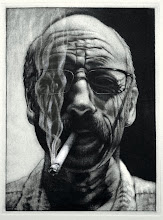
Anthony created this black and white monotype, a self portrait that I said looked like Kevin Spacey....he titled it Kevin.

Keep scrolling down and join in on blogging about your TENSION print....

TENSION PORTFOLIO

Allison's solarplate relief.
Rob's intaglio, relief, collagraph.
Michelle's linocut.
Kristie's linocut hand colored.
Krystal's linocut.
Julie's drypoint mezzotint.
Jay's linocut.
Brian's solarplate relief.
Brent silkscreen and relief.
Anthony's linocut.
Alex's linocut.


Allison raised the question in the previous post about perhaps extending the discussion of the Tension prints.  Here are shots of each one, and since some of you didn't get an opportunity to talk about your motivations and ideas concerning these images, maybe you could continue the dialogue here.

Wednesday, December 10, 2008

FINAL CRITIQUE

I'll have some highlight images to post after reviewing the final portfolios of prints, but I wanted to jump in with thoughts and impressions before they faded into the fog of grading.

Our meeting time is from 1:15 - 4:15, but in spite of having an extra week after the last class meeting, there was still a flurry of printing activity in the shop, and yet our discussion faded around 3:00. It would have been great if that flurry had been a constant throughout the semester, but as one student said, "I work better under pressure," so most of the work was done within the past few days.

The discussion started with a recap of printmaking impressions, the "love/hate" relationship was touched on, but that discussion pretty much existed between me and Allison, and we returned to that topic a number of times to open up other possibilities, other perspectives, other takes on love/hate.  Few were offered. We passed around intaglio prints, exchange portfolio prints, relief prints, but there was very little discussion in the course of those sharing moments. I used to kick myself in the butt for not offering my thoughts and impressions when I was a student.  Now I can yak it up, but only for so long as I keep digging for interaction, eventually someone else needs to make an offering.  Once we got to the advanced folks the discussion became a little more interactive.  Rob discussed his approach to creating imagery, particularly through the print processes.  He really has the mindset of a printmaker, engaged with the variety of approaches to creating imagery and following with detailed explanations of how he created those images, and he clearly recognizes the perk of "multiples": process over image.  Brent has a very different approach.  He has a "reductive" mindset, or at least for this semester, and had a number of woodcuts, wood-engravings, and a silkscreen/relief combination. His approach is very much from an illustrative perspective: image over process. Julie has been working on a 'quilt' of small relief prints, mostly wood cuts, that she's sewn together by hand. It's an engaging piece, but would be much more so with a companion piece, which she may may be able to accomplish by the time her senior exhibition opens in February.

There was discussion about the trials and tribulations of creating prints, the unpredictability of acid's reaction to metal, such as demonstrated in Krystal's intaglio.  There were also other interesting resolutions in the mix.  Alex did some unique explorations with his intaglio plate; Allison did equally engaging work with her solar plates; Kristie created an image for the "tension" portfolio that she's now hand coloring for the final edition which heightens the tension of the image; Anthony's relief is not only tense in concept, but in execution with all of those tiny diagonal lines defining the image; Jay's "Bloons" was an interesting take on Tension and that's one that I have to think through a little more....a clown hanging from floating balloons...hmmmm; Michelle's was also interesting in concept with a view of an 8-ball - - perhaps calling that last pocket, that always makes me a little tense.

Check back in a few days for final images of the semester.


Tuesday, December 2, 2008

PRINTATHON

Allison at the computer.
Allison's linoleum cut.
Rob's inked intaglio plate.
The resulting first impression.
The inked collagraph board.
Placing the inked collagraph over the intaglio impression. 
The resulting combination of a happy accident.

It was fun going into the shop today, a non-class day, and seeing more than one person working. An encouraging sign for end of the semester activity. Allison had printed her relief and the image above does not do it justice.  In fact, none of the above images above are very good, but it at least documents some interesting activity in the printshop.  Allison created the print by water coloring some Hosho with some very transparent washes of various colors. After the paper dried, she cut out various 'orchid' shapes to chine colle with the linoleum cut, and then printed it onto a decorative Thai paper with subtle fern shapes within the fiber.  The resulting print is beautifully executed.

Rob was working on an intaglio/relief that combined a collagraph on masonite with a reverse etched plate.  He was very focused on it until I showed up with the camera and then the distraction created some interesting results.  After he printed the intaglio, he had the collagraph board inked with both intaglio and a relief roll and was going to print it over the first impression from the plate.  The two maticies have the same imagery, one a postive and one a negative. After he pulled the impression and lifted the collagraph off of the paper, the board had been printed in the opposite direction of the first impression.  Oops.  Usually that results in an obnoxiously symmetrical image, but since he had used some opaque and some transparent colors, the resulting image was very engaging.  Happy accidents in the print shop often create beautiful results.

Let's see more prints. 


Thursday, November 13, 2008

The BFA Critique

last evening's BFA critique raised some interesting points about how we each perceive CREATIVITY.  It was during the discussion of Ben's work when Nate stated that Ben's sculptural pieces were allowing him to "exercise his creativity", thus relegating his functional work to something perhaps less creative.  Rob then interjected distinctions between "producing" brochures in graphic design and images "created" in more traditional studio practice.  Forgive me, Nate and Rob, if I've mischaracterized your comments, but the gist of those thoughts was on some level a bit disconcerting.  It made me realize that we don't spend enough time looking at or thinking about creativity, about the nature of it and how it impacts and influences how we live.

Creativity is a way of both thinking and behaving with both subjectivity and objectivity.  It's a combination of feeling and knowing between what we sense and what we know.  When we're aware of both, when we embrace both, there is a sense of wholeness. Of course I don't think it's possible to have a perfect balance of both, and it's that imbalance that makes us unique to each other.

Our society, in general, is either subjective or objective; in fact, that split kind of typifies the individuals of our society.  The objective person is a knower after the fact, the one who kind of senses the situation and then makes a determination based on that experience. The subjective person is sort of a here and now type, savoring the sensory experience and caring little for the conclusion.

When we combine the two, as I hope we all do, we gain more than both.  We have a more natural conscious balance between extremes. It allows us to see ourselves from a more unique perspective and our wholeness becomes more apparent, more palpable.  We can lead and follow, we can determine our goal and go toward it - - we can design the stimulus and experience the response.

Creativity is expressed in so many ways, infinite ways.  Such as designing a brochure, or throwing, glazing, and firing a mug or a platter.  Creativity has been expressed it the chairs we sit in, the benches we sit on, the orange tables in the studios, the colors of our walls, the patterns in the carpeting, where the little trees have been planted out by the 'lodges', the way we install exhibitions in the gallery, even how we light those exhibitions, and on and on.  I even get creative when I cook, sometimes when I shave.  When we each have an idea that we want realized, we're being creative.  Sometimes our creative solutions may not be as strong as we'd like, but they're still our creative solutions; we're exercising our CREATIVITY.

Wednesday, November 12, 2008

Wednesday's Solarday

After what seemed like an interest in doing Solar plates turned out to be very different.  I went in earlier this morning to do a test plate, an image I put together in Photoshop about my recent dental bridge replacement and that may be the image for the Tension portfolio.  I tried one plate with an exposure of 35 seconds for the aquatint screen and 30 seconds for the transparency. It was over exposed, the teeth looked like big white boxes and the hand-written text was nonexistent.  I tried another plate and cut the exposure back to 30/25...still too much.  My time for experimenting was fading so I decided that for the in-class demo I would use a 25/30 exposure.

When we finally focused on the project of the day, only one person had an idea ready to roll.  So I went through the whole process, how to use the exposure unit, and exposed the plate to the aquatint screen and the transparency, developed/etched, and then proofed the plate. Everything showed up in the proof, but the dense blacks had light areas.  I had printed another transparency and layered it one on top of the other, and as Rob pointed out to me, the density of the layered blacks had blocked each other out thus producing an area that didn't have enough tooth to hold the ink.  That made all kinds of sense.  Good thinking , Rob.

I'm going to try combining the various over exposed plates into a separation image and see if there's anything there.  If not, I'll look for another alternative. Anthony has an image ready to go that's pretty nice, so I guess he'll attack that this weekend.  Everyone else got solar plates and we'll see what happens with them.  We'll look at collagraphs on Monday.

So, when do you want to do a print-a-thon?


Monday, November 10, 2008

Monday's Discussion

Seeing where we are with things was helpful, I think, in getting everyone to realize how time moves more rapidly toward a deadline.  Obviously, the work to date has not been proportionate to the amount of time that has passed, especially when you consider the expectations of work outside of class for a 3 credit hour class.  However, as I mentioned, many students today work better under pressure, and the amount of work that needs to be done in the amount of time left in the semester is what I would call pressure. So go at it.

Wednesday we're going to do some experimenting with Solar Plates and Collagraphs.  Perhaps that will spark ideas and motivations consistent with those media.  It might also be a fun idea to have a Friday or Saturday print day.  Turn on some music, grab a box of Krispy Kremes, brew some coffee, and print, print, print.  Think about it; could be fun.

Sunday, November 9, 2008

Monday's Discussion

Tomorrow we'll be looking at the progress that's been made on the various print projects going on in the studio.  We'll be looking at the intaglio prints that have been cooking in the S240 section, and the beginnings of the relief prints.  Those reliefs, I think, are moving a little faster. Any of the portfolio prints that explore the concept of Tension will be looked at in-progress. We should discuss the actual portfolio: what will we create to contain this group of prints?  I'm still looking at possibilities for my contribution, but I think I'm going to go with an intaglio print for a break from the computer.  Some of you may have one layer of black on your B/W monotype ready for discussion and I'm anxious to see how those develop.  The advanced folks have several things going: intaglio, relief, silkscreen, collagraph, and litho.  I'll be interested to see and hear how some of those projects are pulling together.

It's a fast moving semester and there's still alot to accomplish with your work.  Take a close look at the calendar so that you can budget your time in the print studio to meet the needs of the minimum expectations established for your final portfolios.  And remember, the studio is open for you seven days a week, so some of you may want to take advantage of the other five days that are at your disposal; they'll prove to be invaluable to your progress.

Happy printing.


Wednesday, November 5, 2008

Where are we?

Let use the first part of class on Monday, November 10, to see where we are and where we're going in the next few weeks.  There's a lot of work that needs to happen and a lot of activity in the printshop. There are only seven class periods remaining, and if you're one of those who only works during class time, you may find yourself with an incomplete portfolio by the time the semester ends.  Please take advantage of the printshop during times other than class times, it's the only way to get your work accomplished.  Bring your current state of your current projects for discussion.

Monday, November 3, 2008

Black and White Monotypes


I will have the transparent black ink mixed for B&W monotypes that are to be included in your final portfolios.  The image size is variable, but no smaller than 11" x 14" and no larger than 18" x 24". The image should be one that you create for this project, no old drawings from previous studio classes.  The process is just like the reductive three color separation monotype you did at the beginning of the semester, only this time you'll be layering transparent black.  It will require at least three runs through the press to achieve black. The darkest darks will have multiple layers while the lightest greys will likely have only one.  The ink will be a mixture of process black, tint base, setswell compound, and linseed oil.  Each layer is reduced the same manner as before, and registration is the same as well.

Have fun! 

Tuesday, October 28, 2008

Exhibit at Galerie Hertz

I have to admit that it was a little disheartening, maybe even a little discouraging, that Alex and Allison were my only students from Printmaking class to see my exhibit at Galerie Hetrz.  In fact, they were my only students from all of my classes.  My twenty seniors from the seminars haven't been over either, and who knows if they even will go. There was a time when students used to show en masse to their professor's exhibition openings. Either times are changing, or I'm changing, and I don't know if I know how to redesign the paradigm or if I should just accept at as is.

This year's faculty opening last month also had a low student turn-out, especially given that it was on campus and just down the hallway from the studios, and that it introduced our newest faculty member, Brian Harper, in Ceramics.  I used to go to all of my artist-professors' openings, in both undergraduate and graduate schools, sometimes out of curiosity, many times out of respect, maybe even sometimes out of the "brownie-points" awarded for such gestures. Whatever the reason, seeing a body of work created by my professors was big in understanding their aesthetics, the temperament of their criticisms, their processes, and their concepts and how they resolved them.  It used to be that when we, as students, attended exhibition openings of our professors' works, it was about that hunger or hope for refreshment, about absorbing motivation from those veteran artists who we worked so closely with; those who could lift my day by acknowledging my creative efforts with a positive comment or who could send me in a downward spiral by not recognizing my efforts or any of the successes they might have contained.  Attending their openings, or even just seeing their exhibitions after-the-fact, was ultimately because I wanted to see growth in their work as badly as they pushed for growth in mine.

Many students look at us, their professors, and sometimes forget, or are not aware, that we are practicing professional artists.  They also maybe don't realize that the miliue they have chosen to inhabit is the very one we've existed in for, in some cases, decades.  The road they're traveling is the very road we've traveled, and to be engaged in that journey is such an enriching learning experience, both personally and professionally;  to not engage fully in that journey is an underappreciation of the value of that education.

I jokingly said in class a day or so ago that I would award extra credit for those who went to see my exhibit.  My students chuckled at that suggestion.  After class I though it was a little sad that I was, although jokingly on one level and truthfully on another, trying to buy them into going to see my exhibit.  Have times changed so much? Has curiosity become so narrow that it doesn't expand outside of ourselves to include the creative efforts of our colleagues and peers? Have our worlds become too complex and unrewarding to include the celebrations of others? What is the paradigm, and how do we shift it to something that is more inclusive and encompassing?    

Sunday, October 26, 2008

Check This Out (GOOF PRODUCES SOMETHING NEW)


Go see this exhibit.  It'll be worth it in the long run. GALERIE HERTZ, PRESTON ST.

HELLO?

Is there anyone out there?  Is there too much tension in your life, are you stretched and strained? Are you putting too much intellectual effort into coming up with an idea?  Do you need to throw out some possibilities for feedback?  Hello...... 

Sunday, October 19, 2008

My Opening:


Bog II, Digital Monotype, 16" x 24", 2008

The opening today was really great.  It started a little show with about ten or so people, and by 2:00 the gallery was pretty crowded and remained pretty steady until well after 4:00.  Billy, Laura, and Althea did a beautiful job with the installation and the peripherals, Tom did an artful job with the chili, the other 'refreshments', and also his touch on what is turning into a beautiful outdoor garden. The transformation of this space has been amazing, both inside and out.  When people walk into the gallery they marvel at the space before they even notice what's on the walls. It's really a beautiful space for showing and seeing art.

I received a lot of great feedback on the work, 26 pieces that still felt like new work.  Actually, I guess it really is new since other than the faculty exhibition, where six of the pieces were shown, it was the first time all of this work has been exhibited.  And, that it's really a 'new' body of work, unlike the work I had done before.  I enjoyed seeing it all at the same time for the first time, instead of one piece at a time, which is about all I can do in my studio space.  I appreciate very much Allison and Alex stopping by, that meant a lot to me, thank you.  I hope the rest of you printmakers from class will take a little time to go over to see what I've been up to in my studio.  Also, thanks Susan and Marilyn (Scott and John) and Donna for also coming over, that support from my department and faculty spouses (and, actually, my campus) meant a lot as well. The exhibit continues through November 27. 

Tuesday, October 14, 2008

Mid-States Exhibition

This drawing was just accepted into the 54th Annual Mid-States Exhibition at the Evansville Museum in Evansville, IN.  It's a graphite drawing, 22" x 30" on Arches 88, that I executed as part of my "Vices" series (that quit-smoking phase that I'm still battling).  The Juror was Rutger Brandt, Director of Galerie Mokum of Holland, the most well known and respected venue for representational art in the Netherlands.  The exhibit runs from December 7 until January 18.  Go check it out if you have the chance.  

Monday, October 13, 2008

GROUP PORTFOLIO PROJECT


Today we will be discussing a theme-based portfolio project during class.  I have brought in such a portfolio that was developed by Professor Debra Fisher from SUNY Brockport a couple of years ago. The theme was "Walking on Water".  She invited 29 printmakers to respond to that theme and to create an edition of 40 impressions.  Many of you have seen my contribution to the portfolio, but I'll also include it here.  My thinking about walking on water was that in order to do so, I had to get out of the boat.  The print is entitled, Disembark.

So after a show/tell of the Walking on Water portfolio, several theme ideas were put up for consideration: tension, non-portraits, animals, movement, thin-air, music, interpersonal relationships, explosive, personality, and childhood.  The nominating process is now closed, and the theme idea that gets the most votes will be our theme for this exchange portfolio.

Paper size was established at 11" x 14", no minimum image size was set.

Edition size will be 13.  Intaglio or Relief

There are a some interesting possibilities for imagery and processing.  You can vote here so we can all keep track of the tally.  All votes cast by 1:30 on Wednesday.  I'll vote in the case of a tie.

UPDATE:  Tension, act of stretching or straining; state of being stretched or strained; mental or emotional strain; strong intellectual effort; intense suppressed excitement; a strained state of mutual relations; pressure; a state in which a body is stretched or increased in size in one direction with a decrease in size in a certain ratio in a perpendicular direction; a force tending to elongate a body; the condition of a dielectric body when its opposite surfaces are oppositely electrified; potential; a device for stretching or pulling something; a device to hold the proper tension on the material being woven in a loom.

The potentials of this theme are enormous, especially since it defines so effectively the act of printmaking: act of stretching or straining (intaglio and silkscreen); mental or emotional strain (printmaking in general); strong intellectual effort (printmaking in general); intense suppressed excitement (printmaking in general); a strained state of mutual relations (printmaking in general); Pressure......printmaking, printmaking, printmaking.

Printmaking is my medium, my tension.  It holds me captive through its sensual presence and quality, both of which are incomparable: metal plates abraded and etched with marks and textures; inks adjusted for rubbing into and/or rolling onto the matricies; dampened paper to accommodate the subtlest nuances of the relationship between the matrix and the inks once significant pressure is applied.  I love the rituals of moving throughout the printshop to various locations of processing, and the sounds of the press as I turn the wheel to pull an impression.  I love the physicality of printmaking.  It's animated, tactile, fragrant, and real.  It's abundant with the most rewarding of tensions.

So we'll look at some of those possibilities on Monday, your potentials.  Until then, I hope you'll stop by to see my new work on Sunday at Galerie Hertz.  A new body of work: landscapes.  In hindsight, they are my home, my childhood, many of my life-changing experiences.  They represent for me safety and danger at the same time.  They are dense, textured, and magical. Cynthia, my wife, told me this evening that they were about those parts of me that she didn't know because they were parts of me that I didn't tell her, but that she knew nonetheless.


Tuesday, October 7, 2008

BRIAN H. JONES: DIGITAL MONOTYPES

Night Veil, digital w/monotype, relief, crystals 
Passages, digital w/montype

I will be opening an exhibition of new work at Galerie Hertz, 1253 South Preston Street, on Sunday, October 19, with a reception from 1:00 - 4:00. A series of digital monotypes created during the past year.  A Digital Monotype, for my purpose, is an image that has been printed from an inkjet printer and then layered with traditional printmaking inks from relief and nonporous surfaces.  Many of the images are actually layers of images.  After shooting various landscapes from all of our seasons, I manipulate them in photshop to increase their density.  In fact, when I shoot landscapes, it tends to be from a perspective within the landscape rather than at the landscape as I love the density and moodiness of that point of view.  I then print the image onto a heavy Somerset Velvet paper with an Epson 7800 digital printer.  Looking through other landscapes images I've photographed, I find another, usually a different season, that has a similar feel as the first one I printed.  After manipulating that one, I feed the first image through the printer again and layer the second on top.  Sometimes it worked, sometimes it didn't.  I have a pile attesting to the later.  When it didn't work, it was because the sensors in the digital printer couldn't read "white" paper, thereby causing the printer to quit in mid-image.  However, when it did work, that's when I became more passionate about the possibilities.  After having two layers of imagery printed digitally, I then took that print to my French Tool press and often printed color separation monotypes on top or relief patterns, adding more layers to the complexity of the images.

I hope you can stop by for the opening, or at least while it's at the gallery.  

Back From Fargo

Attending the Mid America Print Council conference in Fargo was an interesting five days of travel and print education exposure and I think we all came away from it with new perspectives in many different areas.  There were seven current and former IUS folks.  Besides Donna, Susan, Rob, Jamie, and me, we were joined by Brett, who is working on his MFA at the University of Cincinnati, and Diana, a 2006 BFA graduate in printmaking and who recently moved to Minnesota.  She was very generous toting us around to various conference sites in her BMW.  Of course we had to fold Donna and Rob many times into the luggage compartment to get everyone into the car.  Many thanks to Diana.

The panels we attended were enlightening and covered a wide range of topics: "Printmaking: A System of Languages" was attended by everyone except me as I was presenting to the Board of the MAPC about the American Print Alliance: www.printalliance.org. 

"A Sense of Space", chaired by Karen Kunc.  Several artists on this panel discussed how their senses of space and their geographic locations influence their work, and how that work defined the print tradition, although much of what we saw pushed the boundaries of those traditions.

"The Role of Classical Practices in the Digital Age" explored the relevance of the traditional (classical) practice of observation and experimental interpretation in the participating panelists works.  It was chaired by Cynthia Kukla,  who questioned whether or not artists still embraced the classical methods in a world where imagery sources are so abundant via the internet.  One of the panelists, Flounder Lee, discussed his work which utilizes maping through such sources as GPS and Google Earth, and he documents all of his internet searches in his work.

"Teaching Critical Thinking in Print" was also very enlightening.  Each of the panelists in this presentation raised points about the complexity of relationships in collaboration and criticism. Phyllis McGibbon was an especially interesting presenter as she discussed the extremes of technique driven vs. concept driven instruction and how the integration of concept driven assignments help students to engage in the practice of critical thinking with technical instruction.

Finally, "What?!...a Woodcut?!" brought a few of the country's leading relief artists together to discuss their innovations in that medium.  Karen Kunc was, of course, very interesting in her presentation.  See her work at:  www.karenkunc.com

The exhibits at the conference were too numerous to single any one of them out, but they all were rich in the traditions and innovations of the printmaking media, from centuries old Rembrandts, to current digital applications.

The studio demonstrations were also engaging.  E. C. Cunningham's Phot-intaglio/Collagraph/Monoprint was inspiring. It was a large sheet of masonite with areas built up with gesso, modeling paste, carborundum, and solar plates.  A separation monotype was first printed and then the masonite matrix was inked and wiped intaglio and printed on top.  It was stunning.

Art Werger's Color Mezzotint  www.wergerprint.com demonstration was also very enjoyable. both artists had several of their students helping which expedited their laborious processes to a final impression.  One of the most interesting demonstrations was by Chris Flynn of Anchor Graphics who printed an intaglio digital combination with chine colle.  His passion for printmaking was infectious and I especially appreciated his attention to the craft of his work. The resulting print was beautiful.

Anyway, that's it in a nutshell.  See you tomorrow.   

Tuesday, September 30, 2008

Off to Fargo


We're off to Fargo to Attend the Mid America Print Council conference.  As part of the conference activities, there will be an exchange portfolio with the theme of "Convergence".  This theme is defined as the occurrence of two or more things coming together, and each artist participating in the portfolio and exhibition can interpret that as they see fit.  Each image has an edition of twelve, and each artists who participates will receive a portfolio of ten prints by different artists in exchange.  So we'll bring our portfolios to show next Monday.  The images above are by those of us from IUS who will be participating.  Jamie Klein's lithograph and screenprint combination; Rob Woolley's intaglio with relief roll; Susan Moffett's screenprint with relief, and my digital with relief roll.  I couldn't catch Donna today, but will post hers next week. 

Saturday, September 27, 2008

Mid America Print Council Conference

The MAPC Conference in Fargo, ND starts Wednesday, October 1 and continues through October 5.  I will be attending this conference along with Susan Moffett, Donna Stallard, Rob Woolley, and Jamie Klein.  The conference theme is Convergence (impressions of space we inhabit).  The conference literature explains that we "will explore how artists, educators, and creative people in general are influenced and marked by the spaces they inhabit.  The conference will also examine how the current world of printmaking is affected by vast quantities of available and developing methods and approaches, methods that seem connected to one another (historically, in terms of process, or by physical characteristics) while others seem quite unique.  The theme also questions limits and how they are determined or superseded, and how artists who use prints/printmaking are leaping into open space, or taking the risk to enter vast expanses.
That's a lot to think about.  There will be numerous panel discussions and demonstrations of printmaking techniques. An artist named Chris Flynn will be doing a demonstration of "digital print through press" which interests me a lot since my current work is about taking digital prints and doing traditional printing on top of them.  E.C. Cunningham will be doing photo-intaglio/collagraph monoprints, which seems particularly connected to the theme of the conference.  I hope to see that demonstration as well.  Art Werger will be doing color mezzotints, which I'm sure will be an interesting process.  He's a very meticulous printmaker.

The panel discussions are rich with provocative topics and I wish it were possible to attend them all, but I'll have to pick and choose.  Those of particular interest are: The Role of Classical Practices in the Digital Age, Teaching Critical Thinking in Print, and A sense of space. You can read descriptions of these panels by going to the link below:


See you in class on Monday.

Thursday, September 25, 2008

Color Separation Monotypes


The prints above were created with a three-color separation monotype process.  I may not have had my camera adjusted just right to capture the true colors of the works, but at least you'll be able to see the range of execution possible with this unique print process. There were no particular conceptual parameters to the project, it was mostly to get the beginning students to become familiar with and more acclimated to the printshop and the presses.  Some of the images were inspired by drawings done in previous semesters.  Those posted here are by Alex Kennedy, Julie Anderson, Allison Filippini, Cricket Bidwell, Jay Whitman,  and Kyrstal Clements.

Soap Box 2: Print, Politics & Democracy

Check out the link below for the American Print Alliance.  It is mounting a national exhibition that will then travel for the next few years.  One of my prints was accepted and is reproduced on the site.  Also click on the link with the above title to see other prints in the exhibit.

Tuesday, September 23, 2008

WHAT IS A PRINT?

Go visit this website to see the four main print processes, two of which are the primary areas of focus this semester.

http://www.moma.org/exhibitions/2001/whatisaprint/flash.html

Moving on.....

Hurricane Ike will long be remembered in the Ohio Valley.  The power at my house finally came back on Saturday night, and I know a few of you were still unfortunately without power yesterday.  I can fully understand and appreciate the inconveniences that Ike has caused. However, we have to move on with our work in class.  I can't continue to teaching the art of printmaking to alternating groups. Those of you who have missed classes since the storm should try your best to get caught up.  In the printshop is a very informative studio manual called A Printshop Handbook, by Beth Grabowski.  This textbook details all  of the processes we have been exploring with Intaglio to date, from plate preparation to pulling the first impression.  Please review it particular to line etch and aquatint.

On Wednesday, the 24th, at the beginning of class I will collect all monotypes after they've been signed.  I will discuss that procedure with you then.  Think of what your title might be to include with the signing.  After reviewing the monotypes, I will then attach an evaluation and return them to you within a week.  You may then revise, redo, or create another in response to the evaluation, which will be included in your final portfolio.

Remember, if you've not yet paid your materials fee, please do so ASAP.

See you tomorrow.

Thursday, September 18, 2008

I'll be leaving for Alabama tomorrow and will return Sunday night.  For those of you who are first time etchers working in the shop this weekend, please remember to cover the acid when you're finished etching; turn off the hotplate; return tools and materials where they belong.  

I will be collecting your monotypes on Monday.  

Have a good weekend.
Brian Harper has added to his blog an easily accessible link for voter registration for both Indiana and Kentucky.  If you've not registered to vote yet, here is an easy way to do it.  It's at www.claybucket.blogspot.com

As I'm sure you're all aware, there are some very important issues that we are all facing in this presidential election, so the more who participate in the process, the better for us all.  It may even provide further inspiration for the class project: "POLITICS: ISSUES OF VOTE O8"

PLEASE VOTE!!!!!

Tuesday, September 16, 2008

Hurricane Ike took a big bite out of class yesterday, more than 50% absent.  I understand the difficulties.  So we're a little behind on our schedule and will try to get caught up on Wednesday.  I did not take the monotypes yesterday as planned, but will do so during our next class.  Also, we will need to take a look at October 1 and discuss what we'll be doing that day as I will be out of town attending the Mid America Print Council conference in Fargo, ND.  We're currently scheduled for a soft-ground demonstration, but I think some of the other processes you'll be involved with will easily occupy your workload that day.  We'll discuss it during class.  Rob and Jamie are also attending the conference, but there will still be some experienced printmakers in the studio should you have questions: Julie, Cricket, and Brent.

I hope everyone gets out from under all the Ike debris and will be in class on Wednesday.  See you then.  

Sunday, September 7, 2008


This is the color version of Awakening that I said that I would post in order to demonstrate the difference between the duotone image (below this post) on the cover of Contemporary Impressions and the actual print.  The color was created by a blended relief roll onto the plate after the image had been inked as an intaglio.  The blend was created with three different inks, two with Cyan (the bottom a bit more intense) and one with Benz Yellow.  Each color was further mixed with transparent tint base and Setswell compound.  I also added a few drops of linseed oil to the mixture so that the relief roll would not pull up any of the intaglio ink;  the intaglio color was stiff and the relief roll was loose. It was important in this printing for the inking combination  to have a strong repulsion of each other since the solar plate was not etched very deep.  I did not want to lose any detail by having the relief roller pull any contrast from the plate. 

Sunday, August 31, 2008

This is the recent issue of Contemporary Impressions with a photopolymer intaglio with relief that I printed in 2007.  Although the cover reproduction is a duotone, a method of printing an image using two colors, usually black and one color, the actual print has a color blend of blues, oranges, and yellows.

Contemporary Impressions is the Journal of the American Print Alliance.  Check it out at www.printalliance.org